Magazine institutions today provide numerous amounts of content to the modern day consumer, whether it is relative to the genre or the pages provided. To get to a magazine being produced and ready to sell, a number of stages have to be produced all equal to the final production.
With this in mind, a classmate and I (Callum Deeney) have carried out a research report on all what’s carried out within the production of ‘Punch’, a magazine that ventured the borders of cartoon humour in the late 19th century. We will be looking at these stages, and what are included within each. The main 3 stages can be interpreted as the institution, the audience as well as the content. Punch magazine was a weekly British humour magazine running from 1841 through to 2002. It became successful though providing humorous anagrams and pictures as a main selling point, eventually being the forefront for ‘cartoons’.
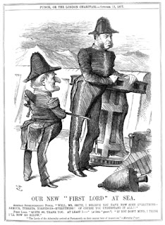
When the magazine was first established, its initial substance was one of comedy and satire, and the general method for the delivery of this essence was through smart jokes, wit and cleverly illustrated cartons in order to provide a backbone to this humorous genre. One of the key issues about the content of punch was that it was not only sophisticated but it also lacked any offensive material which ensured that it could remain a staple among British households for generations to come. Despite the reader friendly basis that the magazine upholds, it was not the main feature that upheld the magazines popularity, this was in fact essentially the instalment of the hand sketched “cartoons” inside the magazine. These would either be delivered within an article to support the main points or it would be separate to any article, and deployed as with a small joke displayed underneath, which would be based upon the said image and this is generally where the magazine generated the majority of its humour. In conjunction with the satirical cartoons, the magazine itself contained articles which would more often than not be related to issues and events at the time and took almost a similar stance to Shakespeare from where the writers used the magazine as a tool get their views of important members of society across than they may do by publicly speaking against these people. As a result of this, newspapers like ‘The Times’ and ‘News of The World’ often allowed Punch to deliver a column or article within their papers, and this again supports the claim that punch magazines content was sophisticated and well delivered enabling them to expand influence over the late 1800s and early 1900s media and entertainment.

The first edition of Punch Magazine was printed by Joseph Last of Fleet Street, with n the early years of its existence selling about 6,000 copies a week, signifying that despite not being around for to long, the magazine had already acquired itself a fairly extensive fan base, which it could build upon in later years. The majority of this fan base would reside in the sophisticated upper and middle classes of society, who would find the clever wit and smart humour of the magazine very appealing. As well as this, children within this society were also enticed and allowed themselves to then take in the cartoons of the magazine for their own entertainment purposes, thus aiding the magazine in appealing to more than just their initial target audience of these high members of society. However, it was this which became the main downfall for the magazines decline in sales and eventual closure of the business.
This concept was linked to the ‘suggester in chief’, who was the leading person with regards to delivering the content found within, whether it be for the look or the topic. The first and most successful of these was a man called Henry Mayhew who was responsible for Punch’s most successful times. He incorporated the idea that ‘politics is funny’, and used this as his vocal point to society. The reason for the success held from these positions within the magazines institution is that no other or media item was produced by the owners of punch, so the producers could exert all their efforts onto Punch, and therefore they could ensure only the best content was delivered within the magazine.
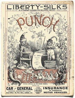
Like many of the modern magazines of today, much of Punch’s income was not directly obtained from the initial selling price, but it is in fact made from the use of advertising within the magazine itself, and in the original issues of the magazine it is clearly identifiable that on the front cover we can see examples of these advertisements, such as the advert for car insurance seen on the front of this issue;

Despite the magazines initial success, it eventually succumbed to the element of time with much of its content becoming outdated to compared to the newer and more appealing comics such as beano and the dandy, and as magazines/comics became more popular amongst lower classes, the upper class began to lose their appeal for such a common media induced factor of entertainment. As a result of this decline in popularity and sales the magazine hit a downward spiral which started towards the end of the 1940s, and despite the magazines commitment to its loyal fan base it was forced to discontinue and by 1992 it was forced to close. In 1996, Four years after the magazine was shut down Mohamed Al-Fayed, an Egyptian businessman purchased the rights to the magazine with the intention of using it a weapon against Private Eye, who Al-Fayed currently had a feud against due to un-favorable articles and criticisms being published within it. Despite its re-institution punch magazine failed to achieve its once overwhelming popularity and was again forced to be shut down in may 2002 after, after recording losses of around £16 million. This would be the final attempt to date of any comeback for punch magazine, and due to the lack of any real success for nearly 70 years, I believe that it will also be the last. However In 2004, much of the archive, including the famous Punch table, was acquired by the British Library, thus helping to reinforce the magazine as a British classic even with the recent failure of the magazine, so the content found within the library will more notably be from the earlier days of the magazine, which was when it achieved greater success and contained more iconic material, such as items produced by the great Charles dickens.


