Tuesday, 5 April 2011

'Mock Up' to 'Main Task' Progression

Since the establishment of my Mock up, I have interpreted and integrated many new ideas, allowing for my main task to become more detailed and hopefully of a more substantial quality.
By creating a mock up, it allows me as an encoder to have a basic aim of what I want the magazine to look like at completion. However maintaining this isn’t vital, with the mock up merely outlining what I want the final piece to look like.
I will be going through each piece and explaining the progression from the mock up to the final piece;


Front Cover
My front cover mock up was designed on paper where I then scanned and uploaded onto my computer. Various tools were incorporated including mastheads, plus lines, snippets and featured articles, each primary fundamentals of any successful magazine.
Each of these were designed within the mock up, with the masthead being located in the same position on the main task, as well as the featured article on ‘Davey Spark’s’ located in the middle.
However, the snippets on the mock up are located in various positions across the page with assorted white areas being found. With this in mind, I changed this and located each of them in a column design up the right hand side. This allows for a more dominating picture within the featured articles area.


DPS
Unlike the Front cover, I designed this mock up on the computer. With my front cover mock up coming out not clear and concise enough, I decided to design this one on Microsoft Word, where I could save the image much clearer.
The design of the mock up relates very well to the main task, with the interview content being integrated in the column system seen in the mock up being used. Along with this, the main heading is similar as well as the picture located underneath.
However I have made changes .These are most prominent with pictures, where ive added a further two pictures related to the interviewer Davey Sparks. This allows for the text not to become to word heavy and allows the encoder to have an outlet from reading.


Contents Page
The contents page I have again mocked up using Microsoft Word, incorporating key elements from the mock up to the main task. The heading and masthead are similar of the mock up, however the 'date and full name' of the magazine has been located in the top right of page rather than 'date and issue number'.
Secondly the plug line at the bottom was added in, again enticing the consumer/decoder to the page and offer.
Originally the mock up held no place for some of the features, so through movement and development, i have split the contents into a ' exclusive' and 'features' section.

Mock Up of DPS

Mock Up Of Front Cover

Mock Up Contents Page

Thursday, 24 March 2011

'Punch Magazine' Report

Magazine institutions today provide numerous amounts of content to the modern day consumer, whether it is relative to the genre or the pages provided. To get to a magazine being produced and ready to sell, a number of stages have to be produced all equal to the final production.
With this in mind, a classmate and I (Callum Deeney) have carried out a research report on all what’s carried out within the production of ‘Punch’, a magazine that ventured the borders of cartoon humour in the late 19th century. We will be looking at these stages, and what are included within each. The main 3 stages can be interpreted as the institution, the audience as well as the content.
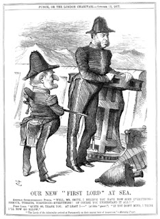
Punch magazine was a weekly British humour magazine running from 1841 through to 2002. It became successful though providing humorous anagrams and pictures as a main selling point, eventually being the forefront for ‘cartoons’.

When the magazine was first established, its initial substance was one of comedy and satire, and the general method for the delivery of this essence was through smart jokes, wit and cleverly illustrated cartons in order to provide a backbone to this humorous genre. One of the key issues about the content of punch was that it was not only sophisticated but it also lacked any offensive material which ensured that it could remain a staple among British households for generations to come.  Despite the reader friendly basis that the magazine upholds, it was not the main feature that upheld the magazines popularity, this was in fact essentially the instalment of the hand sketched “cartoons” inside the magazine. These would either be delivered within an article to support the main points or it would be separate to any article, and deployed as with a small joke displayed underneath, which would be based upon the said image and this is generally where the magazine generated the majority of its humour. In conjunction with the satirical cartoons, the magazine itself contained articles which would more often than not be related to issues and events at the time and took almost a similar stance to Shakespeare from where the writers used the magazine as a tool get their views of important members of society across than they may do by publicly speaking against these people. As a result of this, newspapers like ‘The Times’ and ‘News of The World’ often allowed Punch to deliver a column or article within their papers, and this again supports the claim that punch magazines content was sophisticated and well delivered enabling them to expand influence over the late 1800s and early 1900s media and entertainment.


The first edition of Punch Magazine was printed by Joseph Last of Fleet Street, with n the early years of its existence selling about 6,000 copies a week, signifying that despite not being around for to long, the magazine had already acquired itself a fairly extensive fan base, which it could build upon in later years. The majority of this fan base would reside in the sophisticated upper and middle classes of society, who would find the clever wit and smart humour of the magazine very appealing. As well as this, children within this society were also enticed and allowed themselves to then take in the cartoons of the magazine for their own entertainment purposes, thus aiding the magazine in appealing to more than just their initial target audience of these high members of society. However, it was this which became the main downfall for the magazines decline in sales and eventual closure of the business.
This concept was linked to the ‘suggester in chief’, who was the leading person with regards to delivering the content found within, whether it be for the look or the topic. The first and most successful of these was a man called Henry Mayhew who was responsible for Punch’s most successful times. He incorporated the idea that ‘politics is funny’, and used this as his vocal point to society. The reason for the success held from these positions within the magazines institution is that no other or media item was produced by the owners of punch, so the producers could exert all their efforts onto Punch, and therefore they could ensure only the best content was delivered within the magazine.
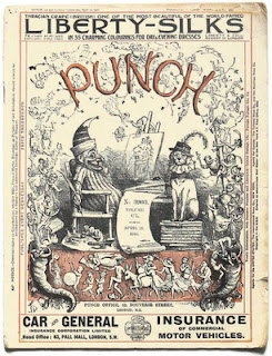
Like many of the modern magazines of today, much of Punch’s income was not directly obtained from the initial selling price, but it is in fact made from the use of advertising within the magazine itself, and in the original issues of the magazine it is clearly identifiable that on the front cover we can see examples of these advertisements, such as the advert for car insurance seen on the front of this issue;


Despite the magazines initial success, it eventually succumbed to the element of time with much of its content becoming outdated to compared to the newer and more appealing comics such as beano and the dandy, and as magazines/comics became more popular amongst lower classes, the upper class began to lose their appeal for such a common media induced factor of entertainment. As a result of this decline in popularity and sales the magazine hit a downward spiral which started  towards the end of the 1940s, and despite the magazines commitment to its loyal fan base it was forced to discontinue and by 1992 it was forced to close. In 1996, Four years after the magazine was shut down Mohamed Al-Fayed, an Egyptian businessman purchased the rights to the magazine with the intention of using it a weapon against Private Eye, who Al-Fayed currently had a feud against due to un-favorable articles and criticisms being published within it. Despite its re-institution punch magazine failed to achieve its once overwhelming popularity and was again forced to be shut down in may 2002 after, after recording losses of around £16 million. This would be the final attempt to date of any comeback for punch magazine, and due to the lack of any real success for nearly 70 years, I believe that it will also be the last.  However In 2004, much of the archive, including the famous Punch table, was acquired by the British Library, thus helping to reinforce the magazine as a British classic even with the recent failure of the magazine, so the content found within the library will more notably be from the earlier days of the magazine, which was when it achieved greater success and contained more iconic material, such as items produced by the great Charles dickens.

Tuesday, 8 March 2011

Time managment Diary


This is a time management diary explaining what tasks need to be done, as well as the date it needs to be done by. With this in mind, it creates a sensible time to create everything by, allowing my work not be rushed and incomplete by the final deadline.

Saturday, 19 February 2011

Looking back at your preliminary task, what do you feel you have learnt in the progression from it to the full product?

Since the construction of the preliminary task, there have been many points and aspects that I have personally developed up till the final production. These improvements are based around both practical sides of work, as well as theoretical in the basis of media as a whole.

When I started the preliminary task, my knowledge of media construction was very basic and was something that needed improving if I was to have any success in the real thing. I had very basic familiarity with the design of any music magazine, and so had to produce a task with no real idea of codes and conventions. To gain this knowledge, research was needed to bring me up to speed with the basic design and input of a music magazine. I did this with semiotic analysis of ‘NME’ and a brief codes and convention description of ‘Golf Monthly’.
These included aspects including mastheads, snippets/features, plug lines, exclusive reports, puff lines, bar codes and sell lines. Through incorporating these things into my main project, it added that professional awareness that you would get within a typical music magazine, however to sell these had to be related to the genre of the magazine, otherwise know one will understand the overall aim. Without these aspects, the magazine just wouldn’t sell, struggling to attract any type of consumer.
What this did was improve the main task technically, compared with preliminary task. It allowed me to understand and exploit the space given, trying to maintain a full look in the magazine signifying good content for the consumers money. This was something not done in the preliminary task, with various gaps displayed throughout.
As well as this, use of fonts and colours were also anticipated into the main task, with the preliminary task only focusing on white font with a blue background. The main task had various colour throughout displaying good organisation as well as a clear positive masthead.

As well as the construction side, the research side was improved as well. In the preliminary task the target was to create a school magazine. This boasted vast problems in the idea of design as well as content within. Questions like ‘Boy or girl?’; ‘Year group?’ and ’interests?’ were all aspects that had to be tackled with each of these having a large area to talk about. What made this easier with regards to the main task, was the construction of the imaginary entity, which provided me with a specific target audience to aim at. Furthemore I could design my magazine based on here, and add specific features that I know would hopefully make vCity a success.

Friday, 18 February 2011

What have you learnt about technologies from the process of constructing this product?

During the construction of the magazine, a number of technology based applications were used. These helped crown down the fundamental ideas into place, and allowed me to make it a reality.
Before I could dive straight into this, I had to carry out some research of other magazines to maintain a grasp of what I needed o include. With this in mind, my first main technology feature was that of the internet. This helped me learn basic key features of what to include, and study already successful layouts like that of NME. This also gave me ideas of how to layout my photos and ways in which I could enhance them and make them dominate effectively.
With this key information in mind, the camera was my next technological process and this was used throughout all 3 main tasks. What I learnt from using the camera was that for the interview/ article to be a success I had to link the pictures in relation to the person’s life rather than what made them famous. This helped create a stronger bond between the consumer and the interviewer, as well as give people an insight to their normal life. Furthermore, I learnt features with regards to the effect of a flash on the skin and eyes, as well changing colour settings based on colours available. E.g.-clothing and background.
Corel draw was the main application we used, with helping make the contents, double page spread and front cover. It allowed us to perform several tasks in the most minuet of detail. These included changing font designs and colours, incorporating the design of a barcode as well as resizing shapes and pictures to our choice. Text was also tampered with, allowing for position and designs seen in many magazines today. These include text on top or around pictures and preference shapes, as well as thickness of text and consistency.
It was this software that differentiated between something made on publisher and looking amateur, to a program used by many professionals. I learnt a number of key points and its these what made the magazine as good as it is.


In relation to Corel draw, Adobe Photoshop was also used with the editing and manufacturing of photos. It was here I learnt image manipulation, how to use different lighting effects as well as add darkness and light transmitters into photos. Using these products allowed me to manufacture a professional looking magazine that has potential to bring success.
 An example below shows lighting being incorporated into the sun;


Storing of the magazine was also important, and this was done through Blogger. This allowed me to successfully store all the work I had done in conjunction with the project in one easy place. I introduced different labels into the blog which split my work up and made it organised. This is a key tool learnt, and is something that can be taken into the universal workplace, as well as my general studies.


How does your media product represent particular social groups?

Representation is the act of communication using symbols and signs, with social groups having a high impact among the depiction of this.
With regards to vCity, there are 3 main social groups that we aim at with regards to target audience. This was seen as an 18-25 year old middle class male.What made vCity unique was making the target audience the same as the representation they wanted. This meant that the encoder represented the target audience they were aiming for.This allows the encoder to know exactly what the target audience want, and allowed the etxt to be free flowing and easy to understand and relate to.
From producing these social groups, maintaining a clear image towards each of these social groups is important for success, so constantly making reference to these factors is imperative. An example would be a male, so advertising male clothes in the ‘Style Special’ was a key factor.
All representation therefore goes through a choice and allows for a selective process to take place within. This can mean that a representation can be constructed through a number of attributes;

·         Experience – If the encoder has experience within the genre of music, they’ll know exactly who to aim there magazine at what interests them with regards to said genre.

·         Intertextuality – Linking the text within to the genre of the magazine is very important as its this what will attract the reader into wanting to buy. If this wasn’t incorporated, vCity would have been poorly received by the target audience.

·         Connotative language – maintaining reasonable respect for the reader was a very important attribute of mine, as it allowed me to make sure vCity wasn’t giving out easily understandable text. It allowed me to write the language in a view that wasn’t ridiculous to understand, but that it made the decoder ponder on certain topics. If I made the reader think, I was hoping that they would think back positively into the past of the genre and will give off a contented vibe when reading. This also plays a key link with the mode of address which in vCity is seen as casual.

Maintaining a positive media representation is very important with regards to the 3 social groups I'm aiming at.  In the midst of the hypodermic model, making sure that these groups of people aren’t seen negatively is very imperative and allowed me to not have a 1 way view of thinking, instead I had to maintain all points of view, stopping vCity be responsible for any negative outcomes from the content.

Thursday, 17 February 2011

What kind of media institution might distribute your media product and why?

When constructing a media magazine, distribution is a key factor that needs to be taken into mind. Finding a distributor that will advertise and work with your magazine successfully is a key component for sales to develop. You’ll have to take into mind competition within this distributor as well as maintaining costs that will bring back a profit.

Maintaining a healthy amount of magazines sold is perhaps the key aim when releasing a magazine, this is known as circulation. With regard to vCity, maintaining positive circulation figures across each month will only bring benefits, allowing the company to bring further income through advertisement, as well increase the price of the magazine due to the reader already being enticed in.

During the research stage for my magazine, I looked into ‘Tatler’ Magazine by the company ‘conde nast publications’. I researched their income figures and managed to design a rate card for the magazine. I found that their circulation figure is £110, 638 with a cover price of £3.99 per issue. There target class falls in the ABC1 category, with 88% of their buyers falling in this range. From here their readership total was calculated as £198, 000 per issue.
With regards to this, advertisement was also a key part to a potential profit being made. It was said that for each single page in ‘Tatler’ it costs £14, 013, with each issue having 111 advertisement pages available. This forms a profit of £1, 555,443 allowing money to be put back into the magazine for further developments.
From here, it was up to me to choose a distributor that could benefit my type of magazine the most. Highlighting key components like vertical integration and conglomeration would only benefit the magazine more, and is something that was greatly received when found. Examples of distributors included;

·         IPC

·         National Magazines

·         Dennis Publishing

·         Conde Nast

Out of these 4, I had to look into each and see whether or not vCity would fit into the distributor portfolio. I had to take into account other music magazines within these distributors, as well as see if there is a potential gap for my magazine to exploit.
   
With these in mind, I decided to choose IPC as its key factors for success were based round my ideal reader. This was due to its male orientated persona, with a number of their magazines being involved in sport and aimed at the ages of 18 – 25. Examples are Golf Monthly and Nuts.

Golf Monthly example.
Once my distributor was chosen, like I did with Tatler, I had to create a rate card that took note of all circulation figures as well as eventual monthly profit.
My magazine was to be sold at £1.60 an issue, making the circulation figure as £61, 657. You can then calculate the monthly profit,  equalling £98, 651.2.
Advertisement per page equals £6769 with 67 advertisement pages being available. This brought in £453 523 through advertisements per monthly issue, helping me put money back into magazine development.

More information is on my vCity Rate Card.

In what ways does your media product use, develop or challenge forms and conventions of real media products?

The basis of this question surrounds genre. Genre refers to a category within the media business that can easily be recognised through repetition of key elements such as characters, settings and dialect. For my magazine to a success, I have to incorporate a specific genre that can relate to my target audience and their surroundings.

With regards to manufacturing a genre, including conventions and forms which have made magazines successful is an important aspect to the everyday consumer. If they feel their not getting specific elements that they already know and effectively love, e.g. – reviews, interviews, they will not be intrigued by the magazine and will in actual fact not purchase it.

Example of a key element in a traditional magazine. These
are features or to many snippets.

Furthermore, including these key elements are very important, and without them will not bring success. However allowing these elements decoder and allows them to treat vCity like they would ‘NME’ and ‘Kerrang’. Examples of what I included in vCity are;

·         Masthead
·         Plug Line
·         Snippets / Features
·         Issue Date
·         Price
·         Barcode
·         Images
·         Colour

In conjunction with this, layout within the magazine is also important. Displaying pieces like exclusive reports and features is imperative when advertising the magazine, as it’s this which makes it feel like a ‘real media product’. From here, it’s up to me as the encoder to make vCity develop these elements, and therefore challenge other magazines for consumer approval. This was done through offering feature outside the music genre, again aiming for the target markets approval.

In relation the forming a ‘real media product’, iconography is another important aspect that has to be incorporated to make my magazine successful. Choosing the right type of image is a vital as it allows the consumer to decode the text with an easy denotative interpretation rather having to deeply analyse it to understand. To choose the correct images, I looked at various music magazines to see ways in which I could layout these images when physically taking them. Knowing exactly what responds well with consumers will only benefit the article and the magazine. This allows me to make vCity look more like a ‘real media product’ and effectively be successful.
It showed that images involving the person in everyday life is more appealing as it connotates the person as someone on the reader’s level, and someone they can therefore relate with.


How did you attract/address your audience?

When creating a music magazine, a specific target audience has to be designed for it to aim at. Each part of the magazine has to integrate all the features of the target audience, hopefully making it successful and well maintained magazine for years to come.

Before I could dive straight into designing a front cover, I had to find a small group of magazines and investigate and analyse them with regards to general layout. With me already having an idea of my target audience, this allowed me to understand the general layout for this and know what I need to include. I had to take note of all key features including, masterhead’s, snippets, plug lines and a price. Knowing what designs sell well and what designs don’t, I can incorporate these ‘selling’ features into mine and make my magazine successful. An example of me analysing a successful magazine can be seen here.

When taking on the encoder of a magazine, the language between you and the decoder has to represent a comfortable dialect between the two. With this in mind, a ‘mode of address’ has to be incorporated. A mode of address can be defined as the relationship between the encoder and decoder, with regards to reflections made within magazine.
To make my magazine successful, I had to establish this bond and carry it out in a positive manor.

With me aiming at an 18-25 middle class male, a feeling of casual awareness is seen within this age group, and is therefore created as the mode of address. To achieve a successful magazine, this mode of address has to be seen throughout and include didactic language that the target audience decoder can understand and feel comfortable reading.


However to achieve this plan, I had to test my front cover on a small group to check I was getting the decoded response I wanted. This is regarded as Stuart Hall’s encoding decoding model, where there are 4 possibly responses I could obtain from my magazine. These are dominant reading, negotiated reading, oppositional reading and aberrant reading. Dominant reading defines that the reader fully understands the text and accepts the code for what it is.
Negotiated reading is similar to dominant reading as it signifies that the majority of the texts code is accepted, however it can be modified and edited in a way the reflects the decoders past experiences and interests.
Oppositional reading is when in a social situation places the reader in front of the dominant response. The reader understands the information however rejects it and brings to earth an alternative aim and indication.
Aberrant reading is when the reader is unable to take the meaning that the encoder has introduced in the text. This unlocks dissonance between both the intellectual assumption of the encoder and the cultural understanding on the decoder, which means the decoder just doesn’t understand.
With regards to my magazine, negotiated reading was the response present. It contained many dominant responses in comparison to the target audience questionnaire however 6 of the questions have incorporated different answers. The responses that have been demonstrated differently can be regarded as open questions, which mean they can be answered based on their cultural surrounding and past experiences.

Price was another factor that needed to be looked at when attracting people to my magazine. From analysing the ‘Golf Weekly’ magazine, ‘NME’ and concentrating on ‘Tatler’, I took into mind the amount paid with regards to the contents present within. I then needed to find a price that reflected a potential amount paid by my target audience, a middle aged male. I found this to be £1.60 /$ 4.50.


Once a target audience and imaginary entity had been established, features associated with the front cover can now be introduced. These again have to interest the target audience, being related to the chosen music genre.

When buying a magazine, one of the first things people look at is the masterhead. When establishing a successful masterhead, colour and boldness are two of the main features that need to be incorporated. Containing a strong eye catching colour on a comprising background will always catch the consumer’s judgment.
vCity incorporates a bold ‘sky blue’ colour with a black background drop, including an underline to entice the name at hand. Deeper connotation suggests an aggressive feel to the name, which wants the consumer to come across and see ‘drum and bass’ for its hard hitting music!


To the side of the masterhead elaborates the features report. It’s located at the top right hand side of the page overlooking the potential features. Its location can connotate a meaning of superiority over the features underneath, which allows this more detailed report to be one of the mains selling points of the page for consumers to see and effectively read.
Colour is again another important aspect when introducing a magazine, especially with regards to vCity. Green was selected as one of the main colours due to its welcoming and friendly feel; deeper connotation suggests that if the fronts cover makes the decoder feel comfortable and enticed, they’ll be more likely to look in at more detail and hopefully buy.


The next main colour available is orange. Polysemic denotation suggests a colour that only works well with the previous colour green, however connotation could argue that it’s vibrant and contracting feel with the background signifies an eye-catching colour made for the consumer to be drawn too. If easily noticeable colours weren’t used, vCity would have a very slim chance of selling.

The picture is the main centre piece of the magazine. The picture signifies  ‘Davey Sparks’ as the main person within the magazines main piece. With the articles tag line being held under the picture with a bigger font, this is open to didactic interpretation meaning the reader can get the understanding of the magazines through denotation.  If this is the case, the reader should easily understand the magazine and shouldn’t be put off buying it.

Main picture identifies Davey Sparks

A plug line is another way the reader is attracted to vCity. The use of adding a ‘Free!’ plug line at the bottom makes the reader think their getting a good deal for the money their paying, allowing them to trust the magazine and hopefully buy again.

When releasing a magazine, providing quality content which has made so many music magazines successful is a main objective. Providing pieces like, reports, features, plug lines, competitions and reviews, are the real expectations consumers want and I feel vCity has accomplished this.


Tuesday, 15 February 2011

Who would be the audience for your media product?

When creating a media based magazine, a specific target audience has to be in place for it to be a success. This allows the encoder to aim all the objectives at this specific audience and establish a good understanding between the encoder and the decoder.
Within my blog’s Target Audience section, I have integrated an appropriate target audience that signifies an age range, gender and social class to aim for. This was developed through the construction of a questionnaire using, which enabled me to establish a Lifestyle Profile which includes everything about my target audience.
From here, the production stage of the front cover has to be designed, and this therefore has to involve all the qualities of the lifestyle profile. To be able to ensure that I have included the qualities, I asked a small group of people the same questionnaire (used when establishing my lifestyle profile) to see who they thought I was aiming the magazine front cover towards. A positive range of answers were found and can be seen here.
Detailed information of this is available within the links above.