Thursday, 17 February 2011

What kind of media institution might distribute your media product and why?

When constructing a media magazine, distribution is a key factor that needs to be taken into mind. Finding a distributor that will advertise and work with your magazine successfully is a key component for sales to develop. You’ll have to take into mind competition within this distributor as well as maintaining costs that will bring back a profit.

Maintaining a healthy amount of magazines sold is perhaps the key aim when releasing a magazine, this is known as circulation. With regard to vCity, maintaining positive circulation figures across each month will only bring benefits, allowing the company to bring further income through advertisement, as well increase the price of the magazine due to the reader already being enticed in.

During the research stage for my magazine, I looked into ‘Tatler’ Magazine by the company ‘conde nast publications’. I researched their income figures and managed to design a rate card for the magazine. I found that their circulation figure is £110, 638 with a cover price of £3.99 per issue. There target class falls in the ABC1 category, with 88% of their buyers falling in this range. From here their readership total was calculated as £198, 000 per issue.
With regards to this, advertisement was also a key part to a potential profit being made. It was said that for each single page in ‘Tatler’ it costs £14, 013, with each issue having 111 advertisement pages available. This forms a profit of £1, 555,443 allowing money to be put back into the magazine for further developments.
From here, it was up to me to choose a distributor that could benefit my type of magazine the most. Highlighting key components like vertical integration and conglomeration would only benefit the magazine more, and is something that was greatly received when found. Examples of distributors included;

·         IPC

·         National Magazines

·         Dennis Publishing

·         Conde Nast

Out of these 4, I had to look into each and see whether or not vCity would fit into the distributor portfolio. I had to take into account other music magazines within these distributors, as well as see if there is a potential gap for my magazine to exploit.
   
With these in mind, I decided to choose IPC as its key factors for success were based round my ideal reader. This was due to its male orientated persona, with a number of their magazines being involved in sport and aimed at the ages of 18 – 25. Examples are Golf Monthly and Nuts.

Golf Monthly example.
Once my distributor was chosen, like I did with Tatler, I had to create a rate card that took note of all circulation figures as well as eventual monthly profit.
My magazine was to be sold at £1.60 an issue, making the circulation figure as £61, 657. You can then calculate the monthly profit,  equalling £98, 651.2.
Advertisement per page equals £6769 with 67 advertisement pages being available. This brought in £453 523 through advertisements per monthly issue, helping me put money back into magazine development.

More information is on my vCity Rate Card.

In what ways does your media product use, develop or challenge forms and conventions of real media products?

The basis of this question surrounds genre. Genre refers to a category within the media business that can easily be recognised through repetition of key elements such as characters, settings and dialect. For my magazine to a success, I have to incorporate a specific genre that can relate to my target audience and their surroundings.

With regards to manufacturing a genre, including conventions and forms which have made magazines successful is an important aspect to the everyday consumer. If they feel their not getting specific elements that they already know and effectively love, e.g. – reviews, interviews, they will not be intrigued by the magazine and will in actual fact not purchase it.

Example of a key element in a traditional magazine. These
are features or to many snippets.

Furthermore, including these key elements are very important, and without them will not bring success. However allowing these elements decoder and allows them to treat vCity like they would ‘NME’ and ‘Kerrang’. Examples of what I included in vCity are;

·         Masthead
·         Plug Line
·         Snippets / Features
·         Issue Date
·         Price
·         Barcode
·         Images
·         Colour

In conjunction with this, layout within the magazine is also important. Displaying pieces like exclusive reports and features is imperative when advertising the magazine, as it’s this which makes it feel like a ‘real media product’. From here, it’s up to me as the encoder to make vCity develop these elements, and therefore challenge other magazines for consumer approval. This was done through offering feature outside the music genre, again aiming for the target markets approval.

In relation the forming a ‘real media product’, iconography is another important aspect that has to be incorporated to make my magazine successful. Choosing the right type of image is a vital as it allows the consumer to decode the text with an easy denotative interpretation rather having to deeply analyse it to understand. To choose the correct images, I looked at various music magazines to see ways in which I could layout these images when physically taking them. Knowing exactly what responds well with consumers will only benefit the article and the magazine. This allows me to make vCity look more like a ‘real media product’ and effectively be successful.
It showed that images involving the person in everyday life is more appealing as it connotates the person as someone on the reader’s level, and someone they can therefore relate with.


How did you attract/address your audience?

When creating a music magazine, a specific target audience has to be designed for it to aim at. Each part of the magazine has to integrate all the features of the target audience, hopefully making it successful and well maintained magazine for years to come.

Before I could dive straight into designing a front cover, I had to find a small group of magazines and investigate and analyse them with regards to general layout. With me already having an idea of my target audience, this allowed me to understand the general layout for this and know what I need to include. I had to take note of all key features including, masterhead’s, snippets, plug lines and a price. Knowing what designs sell well and what designs don’t, I can incorporate these ‘selling’ features into mine and make my magazine successful. An example of me analysing a successful magazine can be seen here.

When taking on the encoder of a magazine, the language between you and the decoder has to represent a comfortable dialect between the two. With this in mind, a ‘mode of address’ has to be incorporated. A mode of address can be defined as the relationship between the encoder and decoder, with regards to reflections made within magazine.
To make my magazine successful, I had to establish this bond and carry it out in a positive manor.

With me aiming at an 18-25 middle class male, a feeling of casual awareness is seen within this age group, and is therefore created as the mode of address. To achieve a successful magazine, this mode of address has to be seen throughout and include didactic language that the target audience decoder can understand and feel comfortable reading.


However to achieve this plan, I had to test my front cover on a small group to check I was getting the decoded response I wanted. This is regarded as Stuart Hall’s encoding decoding model, where there are 4 possibly responses I could obtain from my magazine. These are dominant reading, negotiated reading, oppositional reading and aberrant reading. Dominant reading defines that the reader fully understands the text and accepts the code for what it is.
Negotiated reading is similar to dominant reading as it signifies that the majority of the texts code is accepted, however it can be modified and edited in a way the reflects the decoders past experiences and interests.
Oppositional reading is when in a social situation places the reader in front of the dominant response. The reader understands the information however rejects it and brings to earth an alternative aim and indication.
Aberrant reading is when the reader is unable to take the meaning that the encoder has introduced in the text. This unlocks dissonance between both the intellectual assumption of the encoder and the cultural understanding on the decoder, which means the decoder just doesn’t understand.
With regards to my magazine, negotiated reading was the response present. It contained many dominant responses in comparison to the target audience questionnaire however 6 of the questions have incorporated different answers. The responses that have been demonstrated differently can be regarded as open questions, which mean they can be answered based on their cultural surrounding and past experiences.

Price was another factor that needed to be looked at when attracting people to my magazine. From analysing the ‘Golf Weekly’ magazine, ‘NME’ and concentrating on ‘Tatler’, I took into mind the amount paid with regards to the contents present within. I then needed to find a price that reflected a potential amount paid by my target audience, a middle aged male. I found this to be £1.60 /$ 4.50.


Once a target audience and imaginary entity had been established, features associated with the front cover can now be introduced. These again have to interest the target audience, being related to the chosen music genre.

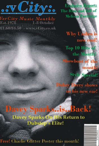
When buying a magazine, one of the first things people look at is the masterhead. When establishing a successful masterhead, colour and boldness are two of the main features that need to be incorporated. Containing a strong eye catching colour on a comprising background will always catch the consumer’s judgment.
vCity incorporates a bold ‘sky blue’ colour with a black background drop, including an underline to entice the name at hand. Deeper connotation suggests an aggressive feel to the name, which wants the consumer to come across and see ‘drum and bass’ for its hard hitting music!


To the side of the masterhead elaborates the features report. It’s located at the top right hand side of the page overlooking the potential features. Its location can connotate a meaning of superiority over the features underneath, which allows this more detailed report to be one of the mains selling points of the page for consumers to see and effectively read.
Colour is again another important aspect when introducing a magazine, especially with regards to vCity. Green was selected as one of the main colours due to its welcoming and friendly feel; deeper connotation suggests that if the fronts cover makes the decoder feel comfortable and enticed, they’ll be more likely to look in at more detail and hopefully buy.


The next main colour available is orange. Polysemic denotation suggests a colour that only works well with the previous colour green, however connotation could argue that it’s vibrant and contracting feel with the background signifies an eye-catching colour made for the consumer to be drawn too. If easily noticeable colours weren’t used, vCity would have a very slim chance of selling.

The picture is the main centre piece of the magazine. The picture signifies  ‘Davey Sparks’ as the main person within the magazines main piece. With the articles tag line being held under the picture with a bigger font, this is open to didactic interpretation meaning the reader can get the understanding of the magazines through denotation.  If this is the case, the reader should easily understand the magazine and shouldn’t be put off buying it.

Main picture identifies Davey Sparks

A plug line is another way the reader is attracted to vCity. The use of adding a ‘Free!’ plug line at the bottom makes the reader think their getting a good deal for the money their paying, allowing them to trust the magazine and hopefully buy again.

When releasing a magazine, providing quality content which has made so many music magazines successful is a main objective. Providing pieces like, reports, features, plug lines, competitions and reviews, are the real expectations consumers want and I feel vCity has accomplished this.



Tuesday, 15 February 2011

Who would be the audience for your media product?

When creating a media based magazine, a specific target audience has to be in place for it to be a success. This allows the encoder to aim all the objectives at this specific audience and establish a good understanding between the encoder and the decoder.
Within my blog’s Target Audience section, I have integrated an appropriate target audience that signifies an age range, gender and social class to aim for. This was developed through the construction of a questionnaire using, which enabled me to establish a Lifestyle Profile which includes everything about my target audience.
From here, the production stage of the front cover has to be designed, and this therefore has to involve all the qualities of the lifestyle profile. To be able to ensure that I have included the qualities, I asked a small group of people the same questionnaire (used when establishing my lifestyle profile) to see who they thought I was aiming the magazine front cover towards. A positive range of answers were found and can be seen here.
Detailed information of this is available within the links above.